Designated losers of monetary policy
Since the financial crisis, the government of the UK and the Bank of England have jumped through hoops and twirled around in extraordinary gyrations to bail out one of the largest financial centers in the world, the uniquely powerful and at once unaccountable speck of land, the City of London, an incorporated area within London known as the Square Mile; or rather bail out its financial institutions, its way of doing business, and its bonuses; and along the way, bail out banks further afield.
Done in the now classic way. Key ingredient: the Bank of England printed enormous amounts of money, repressed interest rates, and stirred up inflation, which hit 5% in 2011. But somebody had to pay for it: savers and workers. It demolished real wages and purchasing power of the people who make up the rest of the country.
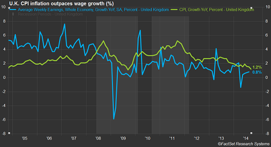
This chart by FactSet shows how average hourly earnings growth (blue line, in percent, seasonally adjusted, year-over-year) has been relentlessly below CPI (yellow line, in percent, year-over-year). It’s the process of pauperization by inflation: