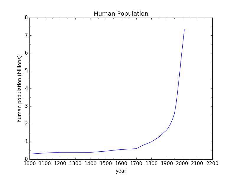
Death by Hockey Sticks
You may be familiar with the term “hockey stick curve,” used describe a trend that has been flat/stable for a very long time, but shoots up at the end of the series in dramatic fashion, resembling the shape of a hockey stick. Hockey can be a violent sport, and it’s easy to get hurt by even one well-aimed swing. Today’s world is being battered from all sides by countless hockey sticks. Mostly, they seem to be targeting Earth’s critters, who are getting bludgeoned unsparingly. But in the end, we’re only harming ourselves.
This post is structured as a gauntlet of hockey stick curves that may leave the reader feeling a bit bruised. Depending on what’s being plotted, many of the graphs shoot up like an exponential, but a few are careening downwards. A theme emerges: the “bads” go up, and the “goods” go down—and not by coincidence.
People and Money
We’ll start simply. Human population looks like a hockey stick curve. This is not a surprise to anyone. The fact is greeted with a range of reactions from joy to despair, but mostly simple acceptance. Whatever your disposition, here’s what it looks like.
All the plots in this post will share the same time axis, from the year 1000 to 2200—even for those lacking information across the whole span. The point will be to emphasize the anomalous nature of recent history: what I call the fireworks show. Maybe it would be more fair to use a 10,000 year span (civilization), or 200,000 for modern homo sapiens, or even 3 million years for the entire human saga. On such scales, the present era loses its graceful curve and looks rather more like a sudden brick wall.
…click on the above link to read the rest of the article…

