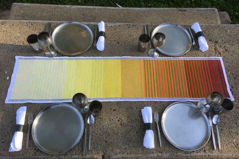
The Recent History of GDP Growth, CO2 Emissions, and Climate Policy Paralysis, All in One Table-Runner

Note: I began designing this table-runner just before the COVID-19 pandemic blew up in the United States. In the time I have been embroidering it, rates of death and misery have soared while wealth generation and carbon emissions (the two subjects of this work) have ended their decades-long rise and have plummeted. A deadly virus is a terrible means of slowing greenhouse warming. Whenever we come out the other side of the pandemic, we must pursue a rapid, humane, ecologically sound, and guaranteed-effective course of action to drive greenhouse emissions down to zero. Here’s how. — P.G.C.

The color of money is the color of calamity
This table-runner illustrates, from left to right, the increase in atmospheric carbon dioxide concentration from 1946 to the present. Each year is represented by two adjacent stripes: one in gradually deepening shades of green representing that year’s U.S. gross domestic product (adjusted for inflation) and one in increasingly intense shades of yellow-orange-red, representing CO2 concentration.
There are nine shades for GDP and eleven for CO2, with shades indicating roughly equal intervals of increase in each. The shades of both types of stripes darken as the years go by, in accordance with the increases that occurred in both GDP and CO2. (For hi-res, zoomed-in images of the table-runner, see here.)
The shades of yellow-orange-red in the table-runner darken more and more rapidly as the years pass, illustrating how emissions of CO2 accelerated as industrial output and fossil-fuel use rose more rapidly throughout the world. The concentration of CO2 rose at an annual rate of about 0.8 ppm from 1945 to 1980; 1.5 ppm from 1980 to 1995; and 2.1 ppm from 1995 to 2019. (The United States accounted for almost 20 percent of the rise in atmospheric CO2 during those years.)
…click on the above link to read the rest of the article…