Charts showing the long-term GDP-energy tie (Part 2 – A New Theory of Energy and the Economy)
In Part 1 of this series, I talked about why cheap fuels act to create economic growth. In this post, we will look at some supporting data showing how this connection works. The data is over a very long time period–some of it going back to the Year 1 C. E.
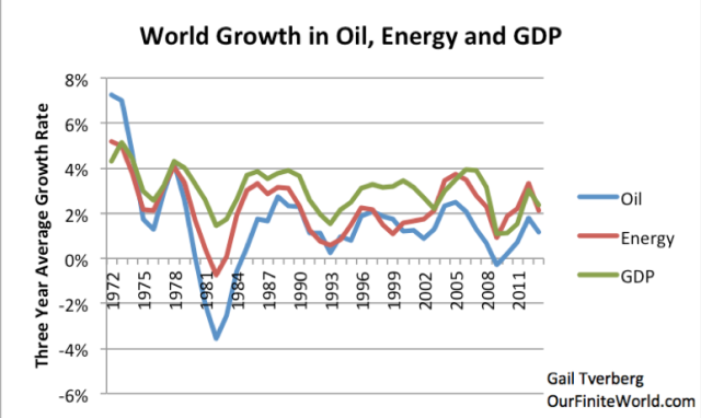
We know that there is a close connection between energy use (and in fact oil use) and economic growth in recent years.
In this post, we will see how close the connection has been, going back to the Year 1 CE. We will also see that economies that can leverage their human energy with inexpensive supplemental energy gain an advantage over other economies. If this energy becomes high cost, we will see that countries lose their advantage over other countries, and their economic growth rate slows.
A brief summary of my view discussed in Part 1 regarding how inexpensive energy acts to create economic growth is as follows:
…click on the above link to read the rest of the article…
