Rapid progress towards clean energy is needed to meet the global ambition to limit warming to no more than 1.5C above pre-industrial temperatures.
But how are countries doing so far? In our Energy Revolution Global Outlook report, written with colleagues at Imperial College London and E4tech – and published by Drax– we rank progress in 25 major world economies.
Our report provides a league table of their efforts to clean up electricity generation, switch from oil to electric vehicles, deploy carbon capture and storage, eliminate fossil fuel subsidies and tackle energy efficiency.
The ten charts below compare these 25 countries today and their progress over the last decade.
Progress on clean electricity
Electricity has been the fastest sector of the economy to decarbonise as countries move away from coal and embrace low-cost renewables. Yet the average carbon intensity of electricity worldwide has fallen only 7% in the last decade to 450 grams of CO2 per kilowatt hour (gCO2/kWh).
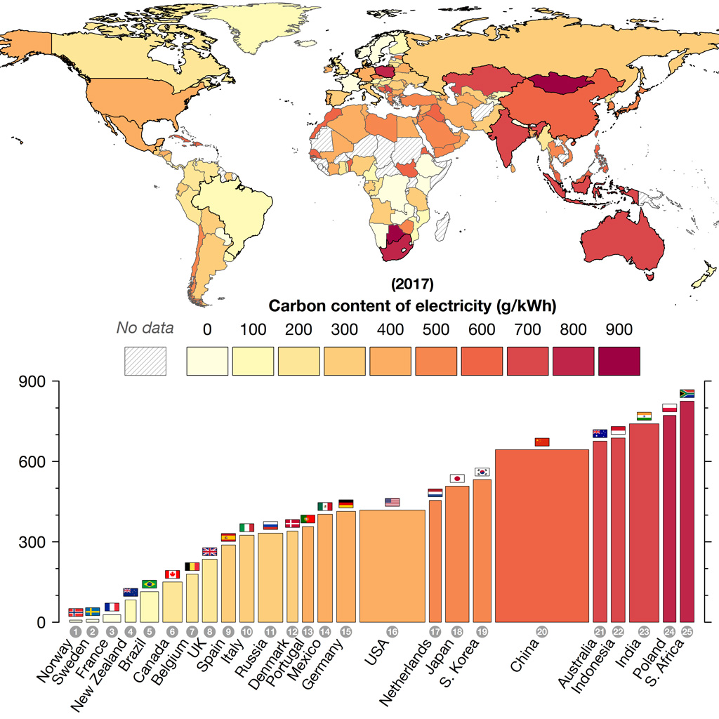
The chart below maps the carbon intensity of electricity generation around the world and ranks the 25 major economies covered by our report. These countries include the G7 group of rich nations along with Brazil, Russia, India, China and South Africa (the “BRICS”) and others. These countries account for 80% of global population, 77% of global GDP and 73% of the world’s CO2 emissions.
Individual countries range from having virtually zero-carbon electricity (in the Nordics, France and New Zealand, left-hand columns in the lower chart) up to near-total reliance on coal (in South Africa and Poland, on the far right).
The carbon intensity of electricity generation during 2017, in grams of CO2 per kWh. The map includes all countries for which data is available. The bar chart ranks 25 major economies including all G7 and BRICS countries. Bar widths represent the amount of electricity consumed in each country, with a minimum width so that smaller countries are still visible. Source: Drax 2018.
…click on the above link to read the rest of the article…
