Toronto’s House Price Bubble Not Fun Anymore
Average price of single-family house plunges 13%, or by C$160,000 from peak. Sales of homes priced over C$1.5 million collapse by 63%. Condos still hanging on.
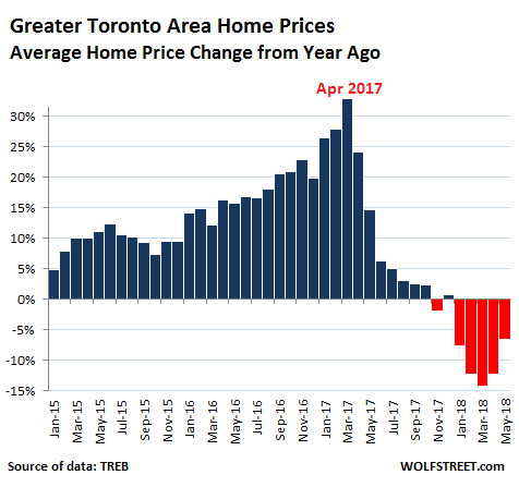
Housing in the Greater Toronto Area is, let’s say, retrenching. Canada’s largest housing market has seen an enormous two-decade surge in prices that culminated in utter craziness in April 2017, when the Home Price Index had skyrocketed 32% from a year earlier. But now the hangover has set in and the bubble isn’t fun anymore.
Home sales plunged 22% in May compared to a year ago, to 7,834 homes, according to the Toronto Real Estate Board (TREB). It affected all types of homes, even the once red-hot condos:
- Detached houses -28.5%
- Semi-detached houses -29.4%
- Townhouses -13.4%
- Condos -15.5%.
It was particularly unpleasant at the higher end: Sales of homes costing C$1.5 million or more plummeted by 46% year-over-year to 508 homes in May 2018, according to TREB data. Compared to the April 2017 peak of 1,362 sales in that price range, sales in May collapsed by 63%.
But it’s not just at the high end. At the low end too. In May, sales of homes below C$500,000 – about 68% of them were condos – fell by 36% year-over-year to 5,253 homes.
The TREB publishes two types of prices – the average price and its proprietary MLS Home Price Index based on a “composite benchmark home.” Both fell in May compared to a year ago.
The average price in May for the Greater Toronto Area (GTA) fell 6.6% year-over-year to C$805,320, and is now down 12.3%, or an ear-ringing C$113,000, from the crazy peak in April 2017.
There are no perfect measures of home prices in a market. Each has its own drawbacks. Average home prices can be impacted by the mix and by a few large outliers – but over the longer term, it gives a good impression of the direction. The chart below shows the percentage change in average home prices in the GTA compared to a year earlier:

…click on the above link to read the rest of the article…