
Home » Posts tagged 'S&P 500' (Page 2)

Tag Archives: S&P 500

Olduvai
Click on image to purchase

Olduvai III: Catacylsm
Click on image to purchase

Post categories

Post Archives by Category

New Harbor: A Time For Staying Out Of Harms Way

New Harbor: A Time For Staying Out Of Harms Way

Preserving your financial capital

Given the brutal start to the markets in the first three weeks of 2016, we thought it a good time to check in with the team at New Harbor Financial. We have had them on our podcast periodically over the past years as the market churned to ever new highs, and have always appreciated their skepticism of these liquidity-driven “”markets”” as well as their unwavering commitment to risk management should the party in stocks end suddenly.

So, how is their risk-managed approach faring now that the S&P 500 has suddenly dropped 8% since Christmas? Quite well. Their general portfolio is flat for the year so far — evidence that caution, prudence and hedging can indeed preserve capital during market downdrafts.

We’ve invited the New Harbor team back on this week to hear their latest assessment on the markets, as well as how they’re approaching their portfolio positioning moving forward:

We spend a lot of time talking about position sizing. Right now we have very little in the stock market. We never cheer for a crash in the sense that we know a lot of people would likely get harmed in such a scenario, but we also spend our time assessing reality and probability. The likelihood of probability for a crash certainly has never been non-zero, but it has developed a greater likelihood than it had even just a few weeks ago. There has been a notable sentiment change.

I’d like to point out: we’re not even a month into the year and we have already clawed back over two years’ worth of gains in the stock market. Even if you look at the S&P 500, which has been the most lofty because of its capitalization-weighted nature, where we are at right now takes us all the way back near the end of 2013.

…click on the above link to read the rest of the article…

The Dow Falls Another 364 Points And We Are Now Down 2200 Points From The Peak Of The Market

The Dow Falls Another 364 Points And We Are Now Down 2200 Points From The Peak Of The Market

Falling - Public DomainIt was another day of utter carnage on Wall Street.  The Dow was down another 364 points, the S&P 500 broke below 1900, and the Nasdaq had a much larger percentage loss than either of them.  The Russell 2000 has now fallen 22 percent from the peak, and it has officially entered bear market territory.  After 13 days, this remains the worst start to a year for stocks ever, and trillions of dollars of stock market wealth has already been wiped out globally.  Meanwhile, junk bonds continue their collapse.  JNK got hammered all the way down to 33.06 as bond investors race for the exits.  In case you were wondering, this is exactly what a financial crisis look like.

Many of the “experts” had been proclaiming that “things are different this time” and that stocks could defy gravity forever.

Now we seeing that was not true at all.

So how far could stocks ultimately fall?

I have been telling my readers that stocks still need to fall about another 30 percent just to get to a level that is considered to be “normal” be historical standards, but the truth is that they could eventually fall much farther than that.

Just this week, Societe Generale economist Albert Edwards made headlines all over the world with his prediction that we could see the S&P 500 drop by a total of 75 percent…

If I am right and we have just seen a cyclical bull market within a secular bear market, then the next recession will spell real trouble for investors ill-prepared for equity valuations to fall to new lows. To bottom on a Shiller PE of 7x would see the S&P falling to around 550.

…click on the above link to read the rest of the article…

2016 Will Be A ‘Cataclysmic Year’ And ‘Investors Should Be Afraid’

2016 Will Be A ‘Cataclysmic Year’ And ‘Investors Should Be Afraid’

Royal Bank Of ScotlandThe Royal Bank of Scotland is telling clients that 2016 is going to be a “cataclysmic year” and that they should “sell everything”.  This sounds like something that you might hear from The Economic Collapse Blog, but up until just recently you would have never expected to get this kind of message from one of the twenty largest banks on the entire planet.  Unfortunately, this is just another indication that a major global financial crisis has begun and that we are now entering a bear market.  The collective market value of companies listed on the S&P 500 has dropped by about a trillion dollars since the start of 2016, and panic is spreading like wildfire all over the globe.  And of course when the Royal Bank of Scotland comes out and openly says that “investors should be afraid” that certainly is not going to help matters.

It amazes me that the Royal Bank of Scotland is essentially saying the exact same thing that I have been saying for months.  Just like I have been telling my readers, RBS has observed that global markets “are flashing the same stress alerts as they did before the Lehman crisis in 2008″

RBS has advised clients to brace for a “cataclysmic year” and a global deflationary crisis, warning that the major stock markets could fall by a fifth and oil may reach US$16 a barrel.

The bank’s credit team said markets are flashing the same stress alerts as they did before the Lehman crisis in 2008.

So what should our response be to these warning signs?

According to RBS, the logical thing to do is to “sell everything” excerpt for high quality bonds…

…click on the above link to read the rest of the article…

Bear Market: The Average U.S. Stock Is Already Down More Than 20 Percent

Bear Market: The Average U.S. Stock Is Already Down More Than 20 Percent

Angry BearThe stock market is in far worse shape than we are being told.  As you will see in this article, the average U.S. stock is already down more than 20 percent from the peak of the market.  But of course the major indexes are not down nearly that much.  As the week begins, the S&P 500 is down 9.8 percent from its 2015 peak, the Dow Jones Industrial Average is down 10.7 percent from its 2015 peak, and the Nasdaq is down 11.0 percent from its 2015 peak.  So if you only look at those indexes, you would think that we are only about halfway to bear market territory.  Unfortunately, a few high flying stocks such as Facebook, Amazon, Netflix and Google have been masking a much deeper decline for the rest of the market.  When the market closed on Friday, 229 of the stocks on the S&P 500 were down at least 20 percent from their 52 week highs, and when you look at indexes that are even broader things are even worse.

For example, let’s take a look at the Standard & Poor’s 1500 index.  According to the Bespoke Investment Group, the average stock on that index is down a staggering 26.9 percent from the peak of the market…

Indeed, the Standard & Poor’s 1500 index – a broad basket of large, mid and small company stocks – shows that the average stock’s distance from its 52-week high is 26.9%, according to stats compiled by Bespoke Investment Group through Friday’s close.

“That’s bear market territory!” says Paul Hickey, co-founder of Bespoke Investment Group, the firm that provided USA TODAY with the gloomy price data.

So if the average stock has fallen 26.9 percent, what kind of market are we in?

To me, that is definitely bear market territory.

The rapid decline of the markets last week got the attention of the entire world, but of course this current financial crisis did not begin last week.

…click on the above link to read the rest of the article…
“We’ve Seen this Before” – in 1999, then Stocks Crashed

“We’ve Seen this Before” – in 1999, then Stocks Crashed

The fourth quarter is normally a very strong quarter, and December exceptionaly strong in the global markets, says Christine Hughes, Chief Investment Strategist at OtterWood Capital. This quarter too, global markets are in the green after a powerful rally in October.

But for the year, the S&P 500 has been stagnating. Wthout the top 10 mega-cap stocks (which are up 14%), the index is actually down 6%. This spread between the top ten names and the rest of the index now amounts to 20%.

“We’ve seen this before,” Hughes says. Last time a spread of this magnitude occurred was in 1999. At that time, the rest of the market was strong. And it ended in a three-year crash. This time, the rest of the market is already weak. Then there’s Glencore, whose collapse would ricochet around the global credit markets and hit stock markets. So here’s Christine Hughes, charts and all:

Video by Christine Hughes, Chief Investment Strategist, OtterWood Capital.

The Fed Induced Farce

The Fed Induced Farce

The minutes from the last Fed meeting were released on Wednesday afternoon. The minutes, along with a squadron of jabbering Fed heads lying about the economy doing great, pretty much locked in the most talked about .25% interest rate increase in world history.  Evidently the Wall Street titans of greed have convinced the muppets higher interest rates are great for stocks, as the market soared by 250 points. As institutional money exits the market on these rigged up days, the dumb money retail investor buys into the market with dreams of riches just like they did with Pets.com in 2000, McMansions in 2005, and Bear Stearns in 2007.

The Fed has lost any credibility they ever thought they deserved by delaying this meaningless insignificant interest rate increase for the last three years, so they will make this token increase in December come hell or high water. They want to give themselves some leeway for easing again when this debt saturated global economy implodes in the near future. The Fed is trapped by their own cowardice and capture by the Wall Street cabal. If they raise rates the USD will strengthen even more than it has already. The USD is already at 11 year highs. It has appreciated by 25% in the last year versus the basket of world currencies. The babbling boobs on the entertainment news channels authoritatively expound with a straight face about the rise in the dollar being due to our strong economic performance. It’s beyond laughable, as the economy has been sucking wind since the day the Fed turned off the QE spigot in October 2014.


Chart of the Day

Anyone with a working brain and an IQ over 100 (eliminates the bimbos and boobs on CNBC) can see the USD isn’t strengthening of its own accord.

…click on the above link to read the rest of the article…


This Time Is The Same——And Worse!

This Time Is The Same——And Worse!

The current stock market melt-up hardly qualifies as limp. Even the robo-machines and hyper-ventilating day traders apparently recognize that their job is to tag the May 2015 highs and then get out of the way.

So when and as they complete their pointless mission, the question recurs as to why the posse of fools in the Eccles Building can’t see that they are inflating one hellacious financial bubble; and that when it blows it will deconstruct their entire 7-year project of make-pretend recovery.

In fact, if it weren’t for the monumental pain and suffering the next bubble collapse will bring to main street, you might even be tempted to urge them on toward the Wile E. Coyote moment just ahead. After all, if 84 straight months of ZIRP and $3.5 trillion of fraudulent debt monetization (QE) brings nothing more than another thundering financial collapse, it will be curtains time at the Fed.

And here’s why they can’t duck the blame this time with tall tales about a global “savings glut” causing lax underwriting in the mortgage market, or the lack of transparency on Wall Street balance sheets.

The fact is, stock prices are just plain nuts and the evidence is all there in plain sight. And so are the intense and manifold economic headwinds arising from all around the planet—–to say nothing of the advanced age of the US business cycle.

At this point, 75% of S&P 500 companies have reported Q3 results, and earnings are coming in at $93.80 per share on an LTM basis. That happens to be 7.4% below the peak $106 per share reported last September, and means that the market today is valuing these shrinking profits at a spritely 22.49X PE ratio.

And, yes, there is a reason for two-digit precision. It seems that in the 4th quarter of 2007 LTM earnings came in at 22.19X the S&P 500 index price. We know what happened next!

…click on the above link to read the rest of the article…

Within Or Without The Stock Bubble Matters A Great Deal

Within Or Without The Stock Bubble Matters A Great Deal

As doubts surrounding QE have grown, there has been a somewhat detectable if still small trend in central banker repentance. Alan Greenspan to an extent has embraced a more decentralized and market framework in his public comments even though he has yet, to my knowledge, actually repudiate his own work more directly. As noted a few days ago, former BoE governor Mervyn King has been far more open and alarming. While that may seem to indicate that monetarists only find free market “religion” once out of the drudgery of their professional office, I think Zhou Xiaochuan, head of the PBOC, performs the exception.

The direction the Chinese central bank has taken since late 2013 seems to confirm that idea more and more. Viewed as a repudiation of textbook monetary tactics and even basic justifications, the PBOC has become if not more “market” oriented at least drastically shifting priorities from the conventional, QE definitions of “growth at all costs” to something like managing that past mistake (as the PBOC took orthodox monetarism to new levels of insanity from 2009 through 2012). Last April, really at the outset of what China was about to do, Zhou issued a warning that looks to have been quite appropriate:

“If the central bank is not a part of the government, it is not efficient in coordinating policies to push forward reforms,” [Zhou] said.

“Our choice has its own rational reasons behind it. But this choice also has its costs. For example, whether we can efficiently cope with asset bubbles and inflation is questionable.”

That certainly seems to be a damning repudiation of the monetary illusion. Faith in the QE world is waning everywhere and with very good reason; it just doesn’t work in anything outside of dangerous financial imbalance and asset price inflation. Even Krugman appears to have wavered:


…click on the above link to read the rest of the article…

What Happens After A Crash?

What Happens After A Crash?

image

Our posts this week have dealt with analyzing the aftermath of the recent historic events that have unfolded in the stock market. However, of all the worthy topics that we have addressed, we have not directly addressed the most important one: the “post-crash” environment. Seeing as though the dramatic market decline in the latter half of August was the tremor from which all other price action has resulted, it stands to reason that we take a good look at it directly. In other words, how has the market historically behaved following similar “crashes”.

We put quotation marks around the word crash as the term is obviously open for interpretation. Certainly anyone who experienced the October 1987 events would be hard pressed to call anything since then a “crash”. However, for the sake of this study we are going to call the recent decline, and any similar such historical selloff, a “crash”. Specifically, we looked at all times in the S&P 500 since 1950 in which the index dropped at least 10% within 10 days (credit to fellow advisor and friend, Paul Schatz [@Paul_Schatz on Twitter] for the concept).

As it turns out, we identified 11 prior unique crash occurrences. By unique, I mean we eliminated any successive crashes and any crashes that were within the confines of a retest of a prior crash. Among the 11, 2 of them – July 1974 and September 2008 – continued to cascade lower, nearly unabated, for several more months. The other 9 resulted in an initial low in relatively short order. By initial low, we mean the first step within a market bottoming process. Those 9 are the subject of today’s Chart Of The Day, and this post. These are the months containing the 9 dates:

  • May 1962
  • May 1970
  • October 1987
  • August 1998
  • April 2000
  • March 2001
  • September 2001
  • July 2002
  • August 2011


…click on the above link to read the rest of the article…

11 Red Flag Events That Just Happened As We Enter The Pivotal Month Of August 2015

11 Red Flag Events That Just Happened As We Enter The Pivotal Month Of August 2015

Red Flags - Public DomainAre you ready for what is coming in August?  All over America, economic, political and social tensions are building, and the next 30 days could turn out to be pivotal.  In July, we saw things start to turn.  As you will read about below, a major six year trendline for the S&P 500 was finally broken this month, Chinese stocks crashed, commodities crashed, and debt problems started erupting all over the planet.  I fully expect that this next month (August) will be a month of transition as we enter an extremely chaotic time in the fall and winter.  Things are unfolding in textbook fashion for another major global financial crisis in the months ahead, and yet most people refuse to see what is happening.  In their blind optimism, they want to believe that things will somehow be different this time.  Well, the coming months will definitely reveal who was right and who was wrong.  The following are 11 red flag events that just happened as we enter the pivotal month of August 2015…

#1 Puerto Rico is going to default on a 58 million dollar debt payment that is due on Saturday.  Even though this has serious implications for the U.S. financial system, Barack Obama has said that there will be no bailout for “America’s Greece”.

#2 As James Bailey has pointed out, the most important trendline for the S&P 500has finally been broken after holding up for six years.  This is a critical technical signal that will likely motivate a significant number of investors to sell off their holdings in the weeks ahead.

#3 The IMF is indicating that it will not take part in the new Greek debt deal.  As a result, the whole thing may completely fall apart

…click on the above link to read the rest of the article…


What the Heck Just Happened in the Global Markets?

What the Heck Just Happened in the Global Markets?

It was the kind of day that shouldn’t have happened. Somebody dropped the ball at CNBC, or something.

Thursday evening, after three morose days in US stock markets, Amazon came out and said it made a profit! OK, a teeny-weeny profit of $92 million, a barely perceptible 0.4% of sales, a rounding error for other thriving companies’ with $23 billion at the top line. But for Amazon, the mere fact that there wasn’t a minus-sign in front of it, for once, was huge.

Its shares soared 22% after hours. The company’s valuation jumped by $40 billion. CNBC exploded with excitement. And Friday should have been a huge day for stocks.

But oh my!

From the first minute on, Amazon’s shares lost steam, drifted lower throughout the day and gave up half of their afterhours gain. The S&P 500 and the NASDAQ lost over 1%, the Dow almost 1%.

It topped off a bad week:

  • The Dow dropped 2.8%, its worst week since December 2014, broke its 200-day moving average, and is in the red for the year.
  • The Dow Transportation index fell 2.8%, its worst week since March, and hit a 9-month low, down 12% for the year.
  • The S&P 500 dropped 2.1%, its third worst week in 2015, and is up a mere 1% for the year.
  • The Nasdaq dropped 2.2%, its worst week since March.
  • The Russell 2000 swooned 3.1%, its worst week since October 2014

It didn’t help that Biotechs collapsed.

Biogen set the tone. It slashed its sales growth forecast for 2015 in half. Its multiple sclerosis drugs, its mainstay, are in trouble. Sales of Tecfidera, its main growth driver since its launch in 2013, ran smack-dab into reports linking it to brain infections. Sales of its injectable MS drug Tysabri and interferon-based MS drug Avonex both fell more than expected. And sales of Plegridy also disappointed. Shares of Biogen plunged 22%, wiping out $25 billion in stockholder wealth.


…click on the above link to read the rest of the article…

Peak Financial Engineering? Trends Spiral South

Peak Financial Engineering? Trends Spiral South

Our corporate heroes hit a snag.

We have long grinned painfully at the ways in which Corporate America and analysts collude to present the quarterly earnings charade in the rosiest light possible. But now, it seems they have reached the end of their magic tricks, and reality is showing through in an increasingly terrible trend.

Analysts concoct sky-high earnings-per-share expectations for quarters in the distant future to obtain “forward-looking,” pro-forma, adjusted, ex-bad-items fictional P/E ratios that they then bandy about to raise “price targets” and justify ludicrous stock valuations.

As the actual quarter draws nearer, these earnings expectations get whittled down to where very little earnings growth is left, if any. This way, corporations have a good chance of beating them, and thus propping up their stocks via an “upside earnings surprise.” If they get it right, it works like a charm.

Over the past four years, 72% of the S&P 500 companies have managed to report higher earnings per share than the analysts’ mean estimates at the time, according toFactSet. And so earnings growth has been on average 2.9 percentage points higher than the mean estimate at the beginning of the quarter, “due to the large number of upside earnings surprises,” as FactSet puts it.

Now the bad news. Currently the S&P 500 companies are projected to report a year-over-year decline in earnings of 4.4% for the second quarter, on a revenue decline of 4.2%. Of the companies in the index, 24 have already reported, which nudged up the estimates at the beginning of Q2, when the earnings decline was pegged at 4.5%.


So everything is estimated to head south. Companies are blaming the dollar, in addition to the weather and a slew of other things. Instead of losing value as it had been for years, the dollar has regained some inconvenient oomph. And inflation has been too low for our corporate heroes.

…click on the above link to read the rest of the article…


The Global Credit Market Is Now A Lit Powderkeg

The Global Credit Market Is Now A Lit Powderkeg

And markets are totally unprepared

The financial markets have had a bit of a tough time going anywhere this year.

The S&P 500 has been caught in a 6% trading band all year, capped on the upside by a 3% gain and on the downside by a 3% price loss. It has been a back-and-forth flurry while the stock market up to this point has simply marked time.

We’ve seen a bit of the same in the bond market: after rising 3.5% in the first month of the year, the ten year Treasury bond has given away its year-to-date gains and then some.

2015 stands in relative contrast to largely upward stock and bond market movement over the past three years.  What’s different this year and what are the risks to investment outcomes ahead?

Higher Interest Rates Ahead

As I have suggested in recent discussions, the probabilities are very high the US Federal Reserve will raise interest rates this year. Yes, Ms. Yellen intimated it may come later, but remember she also canceled her appearance at the Fed’s annual Jackson Hole soiree this year, a meeting that takes place just a bit before the September Fed FOMC meeting. I think the markets are attempting to “price in” the first interest rate increase in close to a decade.

Importantly, we’re talking about the re-pricing of credit in the US financial system and economy broadly. We all know how important credit has been to underpinning the US economy for literally decades now. I believe this is a key part of the story of why markets are acting as they are in 2015. However, there are much larger longer term issues facing investors lurking well beyond the short term Fed interest rate increase to come: bond yields (interest rates) rest at generational lows and prices at generational highs – levels never seen before by investors.  Let’s set the stage a bit, because the origins of this secular issue reach back over three decades.

…click on the above link to read the rest of the article…


Wedges and Triangles: Big Move Ahead?

Wedges and Triangles: Big Move Ahead? 

The central bank high is euphoric, the crash and burn equally epic.

Just out of curiosity, I called up a few charts of key markets: stocks (the S&P 500), volatility (VIX), gold and the U.S. dollar (UUP, an exchange-traded fund for the dollar). Interestingly, all of these charts displayed some version of a wedge/triangle.

In a wedge/triangle (a formation with many variations such as pennants), price traces out a pattern of higher lows and lower highs, compressing price action into the apex of a triangle as buyers and sellers reach an increasingly unstable equilibrium.

As price gets squeezed into a narrowing band, the likelihood increases that price will break out of the triangle, either up or down, in a major move.

So which way will these markets break–up or down? One thing is fairly certain: the S&P 500 (SPX) and the VIX (volatility) are on a see-saw–both don’t soar at the same time. If the VIX soars, stocks are plummeting as fear takes hold. If the VIX stumbles along the bottom of its range, market players are complacent and stocks loft higher.

Many observers see the same inverse relationship in gold and the U.S. dollar–when one is going up, the other is weakening.

I tested this widely accepted truism by aligning the charts of both the U.S. dollar and gold, and found that there were lengthy periods during which gold and the U.S. dollar rose in tandem: About That Supposed Correlation of the U.S. Dollar and Gold…. (July 8, 2013)

My conclusion: each is influenced by a number of factors, some shared, some unique to each asset. As a result of this complex confluence, at times both go up together and at times there is a negative correlation (see-saw effect), and during other periods, there is little correlation, i.e. they act entirely independent of the other.

…click on the above link to read the rest of the article…


charles hugh smith-The Only Two Charts You Need to Understand the S&P 500

charles hugh smith-The Only Two Charts You Need to Understand the S&P 500.

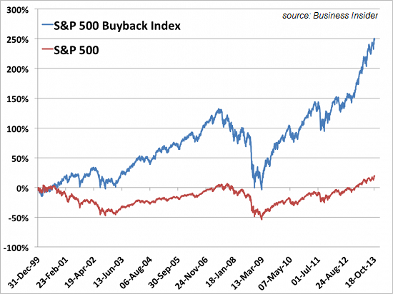
As long as corporations continue borrowing money to buy back their own stocks and the yen keeps dropping, the SPX will continue lofting higher.

Why is the S&P 500 rising, even as valuations are getting stretched, profit growth is declining and sales are stagnant? Two charts explain it all. Here is a chart showing the S&P 500 companies that have been buying back their own stocks (often by borrowing cheap money to do so) and companies that haven’t bought back hundreds of billions of dollars in their own stock.

The unmanipulated sector rose a bit, while the stock buyback crowd soared:


source: Business Insider

Here is the S&P 500, with red lines marking its recent lows:

…click on the above link to read the rest of the article…

Olduvai IV: Courage
Click on image to read excerpts

Olduvai II: Exodus
Click on image to purchase

Click on image to purchase @ FriesenPress