Home » Posts tagged 'financial assets' (Page 2)

Tag Archives: financial assets

Olduvai
Click on image to purchase

Olduvai III: Catacylsm
Click on image to purchase

Post categories

Post Archives by Category

The Last Time These 3 Ominous Signals Appeared Simultaneously Was Just Before The Last Financial Crisis

The Last Time These 3 Ominous Signals Appeared Simultaneously Was Just Before The Last Financial Crisis

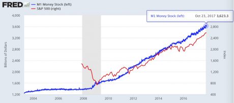
We have not seen a “leadership reversal”, a “Hindenburg Omen” and a “Titanic Syndrome signal” all appear simultaneously since just before the last financial crisis.  Does this mean that a stock market crash is imminent?  Not necessarily, but as I have been writing about quite a bit recently, the markets are certainly primed for one.  On Wednesday, the Dow fell another 138 points, and that represented the largest single day decline that we have seen since September.  Much more importantly, the downward trend that has been developing over the past week appears to be accelerating.  Just take a look at this chart.  Could we be right on the precipice of a major move to the downside?

John Hussman certainly seems to think so.  He is the one that pointed out that we have not seen this sort of a threefold sell signal since just before the last financial crisis.  The following comes from Business Insider

On Tuesday, the number of New York Stock Exchange companies setting new 52-week lows climbed above the number hitting new highs, representing a “leadership reversal” that Hussman says highlights the deterioration of market internals. Stocks also received confirmation of two bearish market-breadth readings known as the Hindenburg Omen and the Titanic Syndrome.

Hussman says these three readings haven’t occurred simultaneously since 2007, when the financial crisis was getting underway. It happened before that in 1999, right before the dot-com crash. That’s not very welcome company.

In fact, every time we have seen these three signals appear all at once there has been a market crash.

Will things be different this time?

We shall see.

If you are not familiar with a “Hindenburg Omen” or “the Titanic Syndrome”, here are a couple of pretty good concise definitions

…click on the above link to read the rest of the article…

This Is What A Pre-Crash Market Looks Like

This Is What A Pre-Crash Market Looks Like

The only other times in our history when stock prices have been this high relative to earnings, a horrifying stock market crash has always followed.  Will things be different for us this time?  We shall see, but without a doubt this is what a pre-crash market looks like.  This current bubble has been based on irrational euphoria that has been fueled by relentless central bank intervention, but now global central banks are removing the artificial life support in unison.  Meanwhile, the real economy continues to stumble along very unevenly.  This is the longest that the U.S. has ever gone without a year in which the economy grew by at least 3 percent, and many believe that the next recession is very close.  Stock prices cannot stay completely disconnected from economic reality forever, and once the bubble bursts the pain is going to be unlike anything that we have ever seen before.

If you think that these ridiculously absurd stock prices are sustainable, there is something that I would like for you to consider.  The only times in our history when the cyclically-adjusted return on stocks has been lower, a nightmarish stock market crash happened soon thereafter

The Nobel-Laureate, Robert Shiller, developed the cyclically-adjusted price/earnings ratio, the so-called CAPE, to assess whether stocks are likely to be over- or under-valued. It is possible to invert this measure to obtain a cyclically-adjusted earnings yield which allows one to measure prospective real returns. If one does this, the answer for the US is that the cyclically-adjusted return is now down to 3.4 percent. The only times it has been still lower were in 1929 and between 1997 and 2001, the two biggest stock market bubbles since 1880. We know now what happened then. Is it going to be different this time?

…click on the above link to read the rest of the article…

The Federal Reserve Has Just Given Financial Markets The Greatest Sell Signal In Modern American History

The Federal Reserve Has Just Given Financial Markets The Greatest Sell Signal In Modern American History

Why have stock prices risen so dramatically since the last financial crisis?  There are certainly many factors involved, but the primary one is the fact that the Federal Reserve has been creating trillions of dollars out of thin air and has been injecting all of that hot money into the financial markets.  But now the Federal Reserve is starting to reverse course, and this has got to be the greatest sell signal for financial markets in modern American history.  Without the artificial support of the Federal Reserve and other global central banks, there is no possible way that the massively inflated asset prices that we are witnessing right now can continue.

The chart below comes from Sven Henrich, and it does a great job of demonstrating the relationship between the Fed’s quantitative easing program and the rise in stock prices.  During the last financial crisis the Fed began to dramatically increase the size of our money supply, and they kept on doing it all the way through the end of October 2017…

Unfortunately for stock traders, the Federal Reserve has now decided to change course, and that means that the process that has created these ridiculous stock prices is beginning to go in reverse.  In fact, according to Wolf Richter this reversal just started to go into motion within the past few days…

On October 31, $8.5 billion of Treasuries that the Fed had been holding matured. If the Fed stuck to its announcement, it would have reinvested $2.5 billion and let $6 billion (the cap for the month of October) “roll off.” The amount of Treasuries on the balance sheet should then have decreased by $6 billion.

…click on the above link to read the rest of the article…

Top Financial Expert Warns Stocks Need To Drop ‘Between 30 And 40 Percent’ As Bankruptcy Looms For Toys R Us

Top Financial Expert Warns Stocks Need To Drop ‘Between 30 And 40 Percent’ As Bankruptcy Looms For Toys R Us

Will there be a major stock market crash before the end of 2017?  To many of us, it seems like we have been waiting for this ridiculous stock market bubble to burst for a very long time.  The experts have been warning us over and over again that stocks cannot keep going up like this indefinitely, and yet this market has seemed absolutely determined to defy the laws of economics.  But most people don’t remember that we went through a similar thing before the financial crisis of 2008 as well.  I recently spoke to an investor that shorted the market three years ahead of that crash.  In the end his long-term analysis was right on the money, but his timing was just a bit off, and the same thing will be true with many of the experts this time around.

On Monday, I was quite stunned to learn what Brad McMillan had just said about the market.  He is considered to be one of the brightest minds in the financial world, and he told CNBC that stocks would need to fall “somewhere between 30 and 40 percent just to get to fair value”…

Brad McMillan — who counsels independent financial advisors representing $114 billion in assets under management — told CNBC on Monday that the stock market is way overvalued.

The market probably would have to drop somewhere between 30 and 40 percent to get to fair value, based on historical standards,” said McMillan, chief investment officer at Massachusetts-based Commonwealth Financial Network.

McMillan’s analysis is very similar to mine.  For a long time I have been warning that valuations would need to decline by at least 40 or 50 percent just to get back to the long-term averages.

…click on the above link to read the rest of the article…

Central Banks Have Purchased $2 Trillion In Assets In 2017

Central Banks Have Purchased $2 Trillion In Assets In 2017 

In his latest “flow report”, BofA’s Michael Hartnett looks at the “Disconnect Myth” between rising stocks and bonds and summarizes succinctly that there is “no disconnect between stocks & bonds.”

Why? The best, and simplest, explanation for low yields & high stocks is simple: so far in 2017 there has been $1.96 trillion of central bank purchases of financial assets in 2017 alone, as central bank balance sheets have grown by $11.26 trillion since Lehman to $15.6 trillion. Hartnett concedes that the second best explanation is bonds pricing in low CPI (increasingly a new structurally low level of inflation due to tech disruption of labor force) while equities price in high EPS (with little on horizon to meaningfully reverse trend), although there is no reason why the second can’t flow from the first.

The result is an era of lower yields & higher stocks, or as the chart below shows, an era in which the alligator jaws of death are just waiting for their moment to shine. Here are the three phases:

  • 1981-2009 (disinflation/Fed put), 10-year Treasury yields down from 15.8% to 3.9% = 10.7% annualized S&P 500 returns;
  • 2009-2016 (Fed QE/global ZIRP) yields down from 3.9% to 2.4% = 14.9% SPX ann. return;
  • 2017 YTD (ECB/BoJ QE) yield down to 2%, SPX annualizing 17.5%.

BofA then gives a list of how to time the endgame, or when bonds become bad for stocks:

  1. yield curve inverts,
  2. lower yields lead to higher credit spreads (particularly high yield & EM bond spreads…watch tech spreads in coming months),
  3. The deflation bonds discounting starts to negatively impact EPS,
  4. flip side is never good sign to see rising yields coincide with falling bank & housing stocks;

The good news is that none of these 4 conditions are being met, for now.

…click on the above link to read the rest of the article…

Half of world’s wealth now in hands of 1% of population – report

Half of world’s wealth now in hands of 1% of population – report

Inequality growing globally and in the UK, which has third most ‘ultra-high net worth individuals’, household wealth study finds

Global inequality is growing, with half the world’s wealth now in the hands of just 1% of the population, according to a new report.

The middle classes have been squeezed at the expense of the very rich, according to research by Credit Suisse, which also finds that for the first time, there are more individuals in the middle classes in China – 109m – than the 92m in the US.

Tidjane Thiam, the chief executive of Credit Suisse, said: “Middle class wealth has grown at a slower pace than wealth at the top end. This has reversed the pre-crisis trend which saw the share of middle-class wealth remaining fairly stable over time.”

The report shows that a person needs only $3,210 (£2,100) to be in the wealthiest 50% of world citizens. About $68,800 secures a place in the top 10%, while the top 1% have more than $759,900. The report defines wealth as the value of assets including property and stock market investments, but excludes debt.

About 3.4 bn people – just over 70% of the global adult population – have wealth of less than $10,000. A further 1bn – a fifth of the world’s population – are in the $10,000-$100,000 range.

Each of the remaining 383m adults – 8% of the population – has wealth of more than $100,000. This number includes about 34m US dollar millionaires. About 123,800 individuals of these have more than $50m, and nearly 45,000 have more than $100m. The UK has the third-highest number of these “ultra-high net worth” individuals.

Pyramid of wealth
The report said: “Wealth inequality has continued to increase since 2008, with the top percentile of wealth holders now owning 50.4% of all household wealth.”
At the start of 2015, Oxfam had warned that 1% of the world’s population would own more wealth than the other 99% by next year. Mark Goldring,

…click on the above link to read the rest of the article…

Here’s Why Housing Must be Propped Up

Here’s Why Housing Must be Propped Up

If housing tanks, the last prop under the veneer of middle class wealth collapses.

The Powers That Be have gone to extraordinary lengths to prop up housing by whatever means are necessary since the collapse of the housing bubble in 2008: the Federal Reserve has pushed mortgages rates down by buying mortgage-backed securities, the federal housing agencies (FHA, VA) have issued millions of low-down payment loans, and the federal government has essentially taken over the mortgage industry, backing 90+% of all mortgage loans.

Why is the status quo so keen on propping up housing? If we examine this chart of U.S. and Chinese household assets, we understand why Chinese authorities would be keen to prop up housing values–75% of China’s household assets are in real estate. Meanwhile, U.S. household assets are predominantly financial:

So why are U.S. authorities going all out to prop up housing if it represents such a modest share of total household wealth? I see two dynamics at work.

The majority of household assets are owned by the top 10%, and this includes the majority of financial assets. The top .1% own 22% of all U.S. household wealth, the top 1% own 35% and the top 10% own 75%.

Households below the top 10% may have financial assets such as insurance policies, 401K accounts or pensions funded by employers, but a house is typically the largest store of value the household owns.

If you want to make the top 1% and top 10% happy, you prop up stocks and bonds. if you want to make the 60% of the populace who own a home happy, you prop up housing.

2. Housing is the only real source of the wealth effect for households below the top 10%.

…click on the above link to read the rest of the article…

“Everyone’s Praying But No One’s Believing” – The ‘Fed Put’ Is Dead

“Everyone’s Praying But No One’s Believing” – The ‘Fed Put’ Is Dead

Chalk Outline

Yellen’s detailed speech initially triggered an out-sized market reaction.  Unfortunately, it was mainly due to shallow market depth and weak-hand positions. The ‘risk-on’ trades that ensued seem driven by positional unwinds from short-term traders. These markets will likely reverse back to lower prices once those initial trades are digested. 

Yellen’s speech should quickly begin to hurt over-priced financial assets. The stellar performance of financial prices over the past several years has primarily been driven by central bank accommodation. The double digit average returns (15%+) of the S&P 500 from 2009-2014 was not driven by economic strength, but rather by massive global central bank actions. There is simply a poor correlation between economic activity and the S&P 500 in any given year.

Since the Fed’s balance sheet flat-lined in 2014 (with the policy rate locked at 0%) risk assets have chopped side-ways-to-lower.  Therefore, a sooner (than priced-in) removal of accommodation should be hurting, not helping, risk assets.

The looming 2015 rate hike, threatened by Yellen and other FOMC members, is desirable and plausible in their eyes due to several factors:

1)  confidence that the US economy is on firmer footing and has moved materially away from crisis conditions;

2) a sense of desire and urgency to move off the ‘zero lower bound’;

3) anxiety about not having any ammunition during the next economic downturn;

4) fear of missing the business cycle and with it the opportunity to move off of zero rates, and;

5) as stated in Yellen’s speech, the potential that holding rates too low for too long “could encourage excessive leverage and other forms of inappropriate risk-taking that might undermine financial stability”.

Yellen’s speech was the first time I can ever remember a Federal Reserve Chairperson commenting that inappropriate risk-taking might be undermining financial stability.  This is explicit confirmation that the Fed’s aim of lifting asset prices in the hopes they bolster broader economic activity has reached the end of its useful life.  Barring a financial or economic disaster, the ‘Fed put’ has been put out to pasture.

…click on the above link to read the rest of the article…


A Major Bank Just Made Global Financial “Meltdown” Its Base Case: “The Worst The World Has Ever Seen”

A Major Bank Just Made Global Financial “Meltdown” Its Base Case: “The Worst The World Has Ever Seen”

When it comes to the epic bubble in China’s economy, it really boils down to one – or rather two – things: a vast debt build up (by now everybody should be familiar with McKinsey’s chart showing China’s consolidated debt buildup) leading to a just as vast build up of excess capacity, also known as capital stock accumulation. And/or vice versa.

It is how China resolves this pernicious, and self-reinforcing feedback loop, that is a far greater threat to the global economy than even what happens to China’s bad debt (China NPLs are currently realistically at a 10-20% level of total financial assets) or whether China successfully devalues its currency without experiencing runaway capital flight and a currency crisis.

One bank that is now less than optimistic that China can escape a total economic meltdown is the Daiwa Institute of Research, a think tank owned by Daiwa Securities Group, the second largest brokerage in Japan after Nomura.

Actually, scratch that: Daiwa is downright apocalyptic.

In a report released on Friday titled “What Will Happen if China’s Economic Bubble Bursts“, Daiwa – among other things – looks at this pernicious relationship between debt (and thus “growth”) and China’s capital stock.  This is what it says:

The sense of surplus in China’s supply capacity has been indicated previously. This produces the risk of a large-scale capital stock adjustment occurring in the future.

Chart 6 shows long-term change in China’s capital coefficient (= real capital stock / real GDP). This chart indicates that China’s policies for handling the aftermath of the financial crisis of 2008 led to the carrying out of large-scale capital investment, and we see that in recent years, the capital coefficient has been on the rise. Recently, the coefficient has moved further upwards on the chart, diverging markedly from the trend of the past twenty years. It appears that the sense of overcapacity is increasing.


…click on the above link to read the rest of the article…

Olduvai IV: Courage
Click on image to read excerpts

Olduvai II: Exodus
Click on image to purchase

Click on image to purchase @ FriesenPress