Home » Posts tagged 'wealth effect'

Tag Archives: wealth effect

Olduvai
Click on image to purchase

Olduvai III: Catacylsm
Click on image to purchase

Post categories

Post Archives by Category

My “Wealth Effect Monitor” & “Wealth Disparity Monitor” for the Fed’s Money-Printer Economy: December Update

My “Wealth Effect Monitor” & “Wealth Disparity Monitor” for the Fed’s Money-Printer Economy: December Update

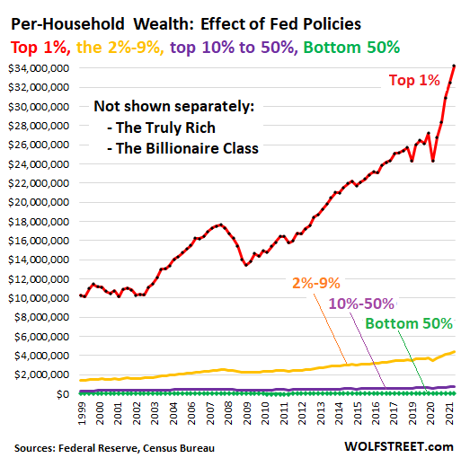
Billionaires got more billions, bottom half of Americans got peanuts and inflation.

My “Wealth Effect Monitor” uses the data that the Fed releases quarterly about the wealth of households. The Fed, after having released the overall data for the third quarter earlier in December, has now released the detailed data by wealth category for the “1%,” the “2% to 9%,” the “next 40%” (the top 10% to 50%) and the “bottom 50%.”

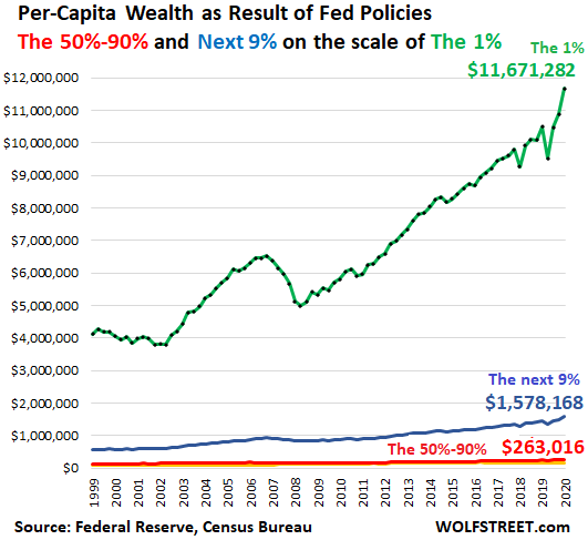
Wealth here is defined as assets minus debts. The wealth of the 1% ($43.9 trillion, according to the Fed) is owned by 1% of the population. The wealth of the “bottom 50%” (only $3.4 trillion) gets split across half the population. My Wealth Effect Monitor takes this a step further and tracks the wealth of the average household in each category.

The average wealth in the 1% category ticked up by only $121,000 in Q3 from Q2, after skyrocketing over the prior five quarters, to $34,478,000 per household (red line). In the bottom 50% category, the average wealth ticked up by $6,800 $53,600 (green line). And get this: About half of that “wealth” at the bottom 50% is the value of consumer durable goods such as cars, appliances, etc. Even the top 2% to 9% (yellow), have been totally left behind by the explosion of wealth at the 1%:

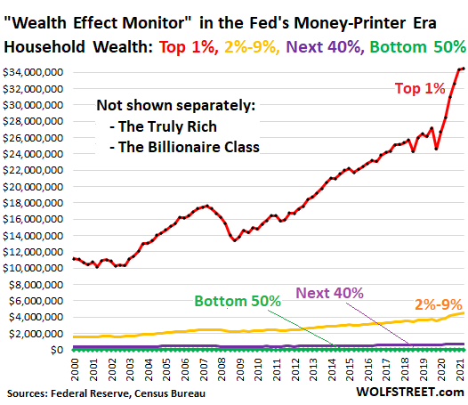
Note the immense increase in the wealth for the 1% households, following the Fed’s money-printing scheme and interest rate repression in March 2020.

A household is defined by the Census Bureau as the people living at one address, whether they’re a three-generation family or five roommates or a single person. In the third quarter, there were 127.4 million households in the US, per Census estimates.

…click on the above link to read the rest of the article…

My “Wealth Effect Monitor” for the Money-Printer Economy: Holy Moly, October Update

My “Wealth Effect Monitor” for the Money-Printer Economy: Holy Moly, October Update

The bottom 50% need not apply. They just get to eat the soaring costs of housing. How the Fed totally blew out the already gigantic wealth disparity during the pandemic.

 On Friday, the Fed released the detailed data about the wealth of households by wealth category for the 1%, the 2% to 9%, the “next 40%” (the top 10% to 50%) and the “bottom 50%” for the second quarter, after having released less detailed figures on September 23. You read the stories at the time about how the Fed’s money-printing and interest-rate-repression has enriched American households.

But the detailed data, just now released, show whose wealth jumped the most, and who got left endlessly further behind. It wasn’t households in general that benefited, but only the richest households with the most assets. The more assets they had, the more they benefited.

My Wealth Effect Monitor divides the wealth (assets minus liabilities) for each wealth category by the number of households in that category, which produces average per-household wealth within each category. The wealth of the bottom 50% is reflected by the jagged green line on the bottom, essentially on top of the horizontal axis:

Not shown separately are the truly rich – the 0.01% – and the Billionaire Class.  The Fed wisely doesn’t provide any information on them separately, but includes them in the Top 1%.

But according to the Bloomberg Billionaires Index, the top 30 US billionaires are worth on average $69 billion per household currently, having gained on average $2.2 billion in wealth each over the quarter.

The bottom 50% of US households (green line above) – 63.2 million households – are worth on average $47,900 per household. But this includes $25,970 in “durable goods” (cars, phones, furniture, etc.), which for consumers are normally considered consumables, not assets, because their values are declining, and they don’t produce incomes.

…click on the above link to read the rest of the article…

I Now Track the Most Important Measure of the Fed’s Economy: the “Wealth Effect” and How it Impacts Americans Individually

I Now Track the Most Important Measure of the Fed’s Economy: the “Wealth Effect” and How it Impacts Americans Individually

The Fed provides the data quarterly, I dissect it at the stunning per-capita level.

The Federal Reserve is pursuing monetary policies that are explicitly designed to inflate asset prices. The rationalization is that ballooning asset prices will create the “wealth effect.” This is a concept Janet Yellen, when she was still president of the San Francisco Fed, propagated in a paper. In 2010, Fed Chair Ben Bernanke explained the wealth effect to the American people in a Washington Post editorial. And in early 2020, Fed Chair Jerome Powell pushed the wealth effect all the way to miracle levels.

Today we will see the per-capita progress of that wealth effect – what it means and what it accomplishes – based on the Fed’s wealth distribution datathrough Q4 2020, and based on Census Bureau estimates for the US population over the years. Here are some key results. At the end of 2020, the per-capita wealth (assets minus debts) of:

  • The 1% = $11.7 million per person (green);
  • The next 9% = $1.6 million per person (blue);
  • The 50% to 90% = $263,016 per person (red line at the bottom).
  • The bottom 50% = $15,027 per person. That amount of wealth is so small it doesn’t show up on this per-capita chart that is on a scale of wealth that accommodates the 1%.

The total population in 2020, according to the Census Bureau, was 330 million people. The 1% amount to 3.3 million people. Back in 2000, the population was 283 million people, and the 1% amounted to 2.8 million people. So the 1% has grown by 473,000 people because the population has gotten larger. And the 50% – the have-nots, as we’ll see in a moment – have grown by 24 million people.

…click on the above link to read the rest of the article…


Unstoppable: The Greatest Depression and the Reverse Wealth Effect

Unstoppable: The Greatest Depression and the Reverse Wealth Effect

We are entering The Greatest Depression because there is no exit.

I’ve endeavored to explain why The Greatest Depression is unstoppable in recent posts:

The Covid-19 Dominoes Fall: The World Is Insolvent March 16, 2020

Pandemic Pandemonium: The Tides of Globalization and Financialization Reverse March 31, 2020

Here’s Why the Economy Won’t Recover–and No, It’s Not Covid-19 or the Lockdown April 23, 2020

What’s Collapsing Can’t Be Saved: Our Fraudulent Economy April 22, 2020

Why Assets Will Crash May 4, 2020

Our Inevitable Collapse: We Can’t Save a Fragile Economy With Bailouts That Increase Fragility May 1, 2020

Globalization and Financialization Are Dead, and so Is Everything That Depended on Them May 15, 2020

Our Fate Is Sealed, Vaccines Won’t Matter: Four Long Cycles Align May 19, 2020

Consumer Spending Will Not Rebound–Here’s Why May 18, 2020

This Is How Systems Collapse May 30, 2020

I’ll try to summarize all this as simply as possible:

1. The global economy’s cost structure has been fatally distorted by central bank policies of inflating asset bubbles and reducing interest rates to near-zero.

2. Earnings from labor have stagnated or eroded since the era of globalization / financialization took off around 2000.

3. Everything costs too much, i.e. is no longer affordable from earnings alone, so the only way to maintain the current costly lifestyle is to borrow money and use it to pay current expenses. This is true for every sector: household, corporate and government.

4. As a result, everyone now needs every dollar of income just to pay their expenses, including interest and principal on their rising debts. There is no slack (buffers) in the system at all.

5. This can be visualized as a row of dominoes. Once the first domino falls, every domino will be toppled.

…click on the above link to read the rest of the article…

This Isn’t Just Another Crash

This Isn’t Just Another Crash

This Isn’t Just Another Crash

Like addicts who cannot control their cravings, financial analysts cannot stop themselves from seeking some analog situation in the past which will clarify the swirling chaos in their crystal balls.

So we’ve been swamped with charts overlaying recent stock market action over 1929, 1987,2000 and 2008 — though the closest analogy is actually the Oil Shock of 1973, an exogenous shock to a weakening, fragile economy.

But the reality is there is no analogous situation in the past to the present, and so all the predictions based on past performance will be misleading. The chartists and analysts claim that all markets act on the same patterns, which are reflections of human nature, and so seeking correlations of volatility and valuation that “worked” in the past will work in 2020.

Does anyone really believe the correlations of the past decade or two are high-probability predictors of the future as the entire brittle construct of fictional capital and extremes of globalization and financialization all unravel at once?

Here are a few of the many consequential differences between all previous recessions and the current situation:

1. Households have never been so dependent on debt as a substitute for stagnating wages.

2. Real earnings (adjusted for inflation) have never been so stagnant for the bottom 90% for so long.

3. Corporations have never been so dependent on debt (selling bonds or taking on loans) to fund money-losing operations (see Netflix) or stock buybacks designed to saddle the company with debt service expenses to enrich insiders.

4. The stock market has never been so dependent on what amounts to fraud — stock buybacks — to push valuations higher.

…click on the above link to read the rest of the article…

The “Nightmare Scenario” For Beijing: 50 Million Chinese Apartments Are Empty

Back in 2017, we explained why the “fate of the world economy is in the hands of China’s housing bubble.” The answer was simple: for the Chinese population, and growing middle class, to keep spending vibrant and borrowing elevated, it had to feel comfortable and confident that its wealth would keep rising. However, unlike the US where the stock market is the ultimate barometer of the confidence boosting “wealth effect”, in China it has always been about housing as three quarters of Chinese household assets are parked in real estate, compared to only 28% in the US, with the remainder invested financial assets.

Source: Xinhua

Beijing knows this, of course, which is why China periodically and consistently reflates its housing bubble, hoping that the popping of the bubble, which happened in late 2011 and again in 2014, will be a controlled, “smooth landing” process.  For now, Beijing has been successful in maintaining price stability at least according to official data, allowing the air out of the “Tier 1” home price bubble which peaked in early 2016, while preserving modest home price appreciation in secondary markets.

How long China will be able to avoid a sharp price decline remains to be seen, but in the meantime another problem faces China’s housing market: in addition to being the primary source of household net worth – and therefore stable and growing consumption – it has also been a key driver behind China’s economic growth, with infrastructure spending and capital investment long among the biggest components of the country’s goalseeked GDP. One result has been China’s infamous ghost cities, built only for the sake of Keynesian spending to hit a predetermined GDP number that would make Beijing happy.

…click on the above link to read the rest of the article…

Hilarious How Wall-Street Crybabies Whine about the Fed’s QE Unwind after a Decade of “Wealth Effect”

Hilarious How Wall-Street Crybabies Whine about the Fed’s QE Unwind after a Decade of “Wealth Effect”

Their “Everything Bubble” is being pricked “gradually,” and they don’t like it.

Wall Street has been moaning, groaning, and crying out loud about the Fed’s current monetary policies – raising rates and unwinding QE. They fear that these policies will undo the Fed’s handiwork since the onset of QE and zero-interest-rate policy in 2008, now called the “Everything Bubble” (stocks, bonds, “leveraged loans,” housing, commercial real estate, classic cars, art…). In an effort to pressure the Fed to back off, they’re accusing the Fed of making a “policy mistake” and creating “scarcity” of bank reserves.

Here is Bloomberg News this morning. It’s really cute how this works. This is how the article starts out: “Fixed-income traders are telling the Federal Reserve that it might end up making a big policy mistake.”

These folks cannot say that the Fed’s QE unwind and higher rates might unwind some of the wealth of asset holders that resulted from the Fed’s desired “wealth effect.” That would be too clear. So they have to come up with hoary theories to back their “policy mistake” theme. This time it’s the theory of a “scarcity of bank reserves.”

When these folks talk about “scarcity,” what they mean is that they have to pay a little more. In this case, banks are having to pay more interest to attract deposits.

For the crybabies on Wall Street, that’s “scarcity.” For savers, money-market investors, and short-term Treasury investors, however, it means the era of brutal interest rate repression has ended, and that they’re earning once again more than inflation on their money (savers might have to shop around).

But that the money from depositors is suddenly not free anymore is anathema on Wall Street. So here we go – this time specifically targeting the QE unwind. Bloomberg:

…click on the above link to read the rest of the article…

Global Housing Bubble Is Popping. Here Comes The “Reverse Wealth Effect”

Global Housing Bubble Is Popping. Here Comes The “Reverse Wealth Effect”

Just a few months ago, real estate was on fire. Prices were blowing past records set during the previous decade’s housing bubble as desperate buyers bought whatever was available at above the asking price while homeowners, confident that prices would keep rising, held out for the next big pop to sell. Notice on the following chart how the ascent steepens at the beginning of this year.

home prices wealth effect

Then, as if someone flipped a switch, the trend shifted into reverse. Not just in the US but nearly everywhere. This list of recent headlines tells the tale:

Housing demand sees biggest drop in more than 2 years

Hamptons property sales slow as caution spreads to the wealthy

Home Prices Are Falling in One of America’s Richest Suburbs

First Time Ever, More Chinese sellers than buyers

Vancouver Suffers Its Worst July for Home Sales Since 2000

Record Drop in Foreigners Buying U.S. Homes

Australian home prices take biggest dip since 2011

The End of the Global Housing Boom

Manhattan Real Estate: Prices Plummet, Sales Tank

What’s happening and why is it happening now?
Several things came together pretty much simultaneously to turn houses from must-have-at-any-price necessities into completely optional and maybe not even desirable: First, prices rose beyond the reach of all but the seriously affluent. The gap between the price of the average home and the size of the mortgage the average local buyer can afford has been rising for years, but recently in the hottest markets it has become a chasm. Meanwhile, mortgage rates have started to rise, increasing the monthly payment on a given house dramatically.

mortgage rates wealth effect

If you live in San Francisco or Sydney or Vancouver, chances are you can’t afford to buy a decent house – not even close. And if you can’t you don’t.

…click on the above link to read the rest of the article…

Taking the Pulse of a Weakening Economy

Taking the Pulse of a Weakening Economy

Corporate buybacks provide the key analogy for the economy as a whole.

Central banks have been running a grand experiment for 9 years, and now we’re about to find out if it succeeds or fails. For 9 unprecedented years, central banks have pushed the pedal of monetary stimulus to the metal: near-zero interest rates, monumental purchases of bonds, mortgage-backed securities, stocks and corporate bonds, injecting trillions of dollars, yuan, yen and euros into the global financial system, all in the name of promoting a “synchronized global recovery” that in many nations remains the weakest post-World War II recovery on record.

The two goals of this unprecedented stimulus were 1) bringing consumption forward and 2) generating a “wealth effect” as the owners of assets rising in value would translate their perception of feeling wealthier into more borrowing and consumption that would then feed a self-sustaining virtuous cycle of expansion.

The Federal Reserve has finally begun reducing its stimulus programs of near-zero interest rates and bond purchases, the idea being that the “recovery” is now robust enough to continue without the extraordinary monetary stimulus of the past 9 years since the Global Financial Meltdown of 2008-09.

Will the “synchronized global recovery” continue as interest rates rise and central bank assets purchases decline? Policy makers and economists evince confidence as they collectively hold their breath–is the recovery now self-sustaining?

2018 is the first test year. Global assets–stocks, bonds and real estate–remain at levels that are grossly overvalued by traditional measures, and most economies are still expanding modestly. But since the other major central banks have only recently begun to “taper” / reduce their securities purchases, the real test has yet to begin.

The pulses of asset valuations and productive expansion are weakening. Asset valuations are either no longer expanding or are actively falling; markets everywhere feel heavy, as if all they need is one good shove to slip into major declines.

…click on the above link to read the rest of the article…

Goldman Shows What A Market Crash Will Do To The Economy

There is a simple reason why for the past decade, despite all the rhetoric central bankers have been focusing on just one thing – reflating risk assets in general and the stock market in particular – because if you get stocks higher, everything else will eventually follow; call it the “wealth effect and confidence pass thru channel.

This observation forms the basis of a report released overnight by Goldman’s economics team, which claims that the 26% increase in the stock market since the start of 2017 “has been the most important driver of the recent easing in financial conditions, which are now at their easiest level since 2000”, something we showed yesterday.

So what has been the stock market’s contribution to the economic rebound since the Trump election? Here Goldman estimates that “higher equity prices are currently boosting GDP growth by nearly +0.6pp, and account for about two thirds of the +1pp growth impulse from overall financial conditions.” 

Of course, the market impulse has to continue – i.e., the market has to keep rising – or else the economic response becomes muted: “Our base case is that the equity impulse to growth decelerates to +0.3pp by Q4 as equity price gains slow” Goldman explains.

For the econometricians, here are some further insights from Goldman on the favorable economic effect from rising stocks

We have argued that the most important reason for the acceleration in growth last year and for growth optimism in 2018 is the sharp positive swing in the impulse from financial conditions, which are now at their easiest level since April 2000. The run-up in the equity component of the FCI has accounted for rughly half of the 137bp index easing in 2017 and 80% of the of 32bp easing year-to-date (Exhibit 1).

…click on the above link to read the rest of the article…

“Wealth Effect” = Widening Wealth Inequality

“Wealth Effect” = Widening Wealth Inequality

Note that widening wealth and income inequality is a non-partisan trend.

One of the core goals of the Federal Reserve’s monetary policies of the past 9 years is to generate the “wealth effect”: by pushing the valuations of stocks and bonds higher, American households will feel wealthier, and hence be more willing to borrow and spend, even if they didn’t actually reap any gains by selling stocks and bonds that gained value.

In other words, the mere perception of rising wealth is supposed to trigger a wave of renewed borrowing and spending.

This perception management only worked on the few households which owned enough of these assets to feel wealthier–the top 5%, the top 6 million out of 120 million households. This chart shows what happened as the Fed ceaselessly goosed financial assets higher over the past 9 years: the gains, real and perceived, only flowed to the top 5% of households earning in excess of $200,000 annually.

Spending by the bottom 95% has at best returned to the levels reached a decade ago in 2007.

By focusing on boosting financial assets to the moon as a means of goosing spending, the Federal Reserve has widened wealth and income inequality to the breaking point. Perception management doesn’t actually boost the inflation-adjusted wages of the bottom 95%, which have stagnated for decades. Nor does boosting assets do much good for the vast majority of households which have modest holdings of stocks and bonds, usually in IRA or 401K retirement accounts they can’t touch without paying steep penalties.

As the charts below illustrate, the Grand Canyon between the top 5% and everyone else is widening. Let’s say a househould has $12,000 in retirement funds and $5,000 in a savings account. (Many households have less than $1,000 in savings, so this example-household is doing pretty well to have $17,000 in cash and financial assets.)

…click on the above link to read the rest of the article…

Yelling ‘Stay’ In A Burning Theater—–Yellen Ignites Another Robo-Trader Spasm

Yelling ‘Stay’ In A Burning Theater—–Yellen Ignites Another Robo-Trader Spasm

Simple Janet has attained a new milestone as a public menace with her speech to the Economic Club of New York. It amounted to yelling “stay” in a burning theater!

The stock market has been desperately trying to correct for months now because even the casino regulars can read the tea leaves. That is, earnings are plunging, global trade and growth are swooning and central bank “wealth effects” pumping has not trickled down to the main street economy. Besides, there are too many hints of market-killing recessionary forces for even the gamblers to believe that the Fed has abolished the business cycle.

So by the sheer cowardice and risibility of her speech, Simple Janet has triggered still another robo-trader spasm in the casino. Yet this latest run at resistance points on a stock chart that has been rolling over for nearly a year now underscores how absurd and dangerous 87 months of ZIRP and wealth effects pumping have become.

As we have indicated repeatedly, S&P 500 earnings—–as measured by the honest GAAP accounting that the SEC demands on penalty of jail——-have now fallen 18.5% from their peak. The latter was registered in the LTM period ending in September 2014 and clocked in at $106per share.

As is shown in the graph below, the index was trading at 1950 at that time. The valuation multiple at a sporty 18.4X, therefore, was already pushing the envelope given the extended age of the expansion.

Indeed, even back then there were plenty of headwinds becoming evident. These included global commodity deflation, a rapid slowdown in the pace of capital spending and the vast build-up of debt and structural barriers to growth throughout China and its EM supply train, as well as Japan, Europe and the US.

…click on the above link to read the rest of the article…

Olduvai IV: Courage
Click on image to read excerpts

Olduvai II: Exodus
Click on image to purchase

Click on image to purchase @ FriesenPress