Home » Posts tagged 'chris hamilton'

Tag Archives: chris hamilton

Olduvai
Click on image to purchase

Olduvai III: Catacylsm
Click on image to purchase

Post categories

Post Archives by Category

Federal Reserve IR Policy – Longer, Lower, and ZIRP Until Something (or Everything) Breaks

Federal Reserve IR Policy – Longer, Lower, and ZIRP Until Something (or Everything) Breaks

The current interest rate cycle began in August of 2019 when the Fed cut rates from the previous cycle high of 2.4% to 2.1%.  The Fed was then fighting the “repo-crisis” in which the Fed was incapable of setting interest rates…and gasp…free-market based interest rates were the result.  And, shocker, they were not “lower for longer”.  So, just thought I’d offer put interest rate cycles in perspective and detail why I anticipate this will be the longest and lowest interest rate cycle with likely zero recovery of those rate cuts.
To begin, the chart below shows interest rate cycles from 1981 through 2020 (and likely through 2040)…and note they grow progressively longer, starting and ending lower, and with less interest rate recovery.  Based on this pattern and the macro’s driving this, this current cycle is likely to be decades at zero (or more likely moving to NIRP) with no rate hikes.

To gauge the changing dynamics of the interest rate cycles, the chart below details the DEPTH of the cut (the percentage from starting rate to cycle low rate), the DURATION (the number of months from initial rate cut to initial rate cut of the next cycle), and the RECOVERY (how much rates are hiked in the hiking phase from the cycle low rate).  Again, the depth of cuts moves progressively greater (essentially 100% for last two cycles), duration stretching from less than a year to over a decade, and recovery moving from outright rate hikes to less than 50% recovery of previous cuts.  Again, this the current cycle, we already have 100% cuts and I anticipate something on the order of twenty years of zero rates meaning zero recovery.

…click on the above link to read the rest of the article…

“Not QE”, Monetization, & “Definitely Asset Inflation”

“Not QE”, Monetization, & “Definitely Asset Inflation”

Chart below shows the Federal Reserve holdings of Treasuries, a weekly change (black columns) and total holdings (red line) during QE1, QE2, Operation Twist, QE3, QT, and “Not QE”.  Got it?!?  This current “Not QE” explosion in QE is like some kind of old time vaudeville act (like the old Abbott and Costello bit, “who’s on first, what’s on second, I don’t know’s on third”).

But looking more widely, the chart below shows the total Federal Reserve balance sheet (blue shaded area), bank excess reserves (red line), and the delta between the Fed’s balance sheet and excess reserves…also known as direct monetization.  As the Fed restarted “not QE” but did not go through the façade of attempting to stock the new money away as “excess reserves”, this new money is flowing straight into assets, like monetary heroine.

Below, a close up of the components above solely in 2019 (through November 6th).  Balance sheet soaring once again since the Fed’s sudden pivot, excess reserves continue falling…and the difference in freshly digitized cash in the hands of banks and the like…ready to be levered up.

So, monetization (yellow line) versus the Wilshire 5000 (green line) from 2014 through last week.  For those not familiar, the Wilshire 5000 total market index, is a market-capitalization weighted index of the market value of all US stocks actively traded in the US.

And fascinatingly, since the beginning of 2018, the Wilshire 5000 and direct monetization are becoming more attuned to one another.  And in mock shock, the new record close in the Wilshire just happens to be accompanied by a new record in direct monetization!?!  Almost as if the addition of $320 billion in fresh digital cash since mid August Fed U-turn had something to do with the $2.2 trillion rise in US equities over the same period (a leverage ratio of about 7x).  Hmmm.

 …click on the above link to read the rest of the article…

Putting Federal Debt In Perspective Against those Responsible In The Future

Putting Federal Debt In Perspective Against those Responsible In The Future

Since 2007, US federal debt has risen 150% while annual US births (legal and otherwise) have fallen almost 14%.  Said otherwise, over the dozen years since 2007, federal debt has increased by $13.8 trillion while 5.2 million fewer births have occurred over the same period than the Census projected.  This is probably worth a little closer look.  Starting with…
US federal debt, split between publicly held debt and IG (Intra-Governmental holdings; aka Social Security trust fund, etc.).  Clearly, publicly held debt is skyrocketing since 2007 while IG growth is decelerating and will turn to net declines (as SS turns to a net seller) within the decade.  Relatively soon, all debt issued will be marketable and significantly more debt will be needed in order to pay for both the spiraling deficit alongside the declining IG holdings.

Next, looking at the annual issuance of federal debt, breaking out the annual issuance of publicly held marketable debt (red columns) versus IG (blue columns).  ***Noteworthy, since August 1st of 2019, the Treasury has issued $920 billion in net new debt through October 23rd.  The chart below is based on the assumption the Treasury will issue another $160 billion through the last two months plus the remainder of October (with a net issuance of $1.1 trillion for calendar year 2019).

Since debt is an obligation to be repaid or serviced in the future, I’ll put this in context with federal debt continuously divided by the future, the quantity of annual births.  Below, annual births from 1950 through 2019 (blue columns) versus federal debt through 2019 (red line).  ***Yes, I’m making a great leap to note that births will continue to fall in 2019…as they have been falling at an accelerating rate through Q1 of 2019, as noted by the CDC (HERE).

 …click on the above link to read the rest of the article…

For Second Week In A Row, Fed Buys Treasuries (AKA, QE4!?!)

For Second Week In A Row, Fed Buys Treasuries (AKA, QE4!?!)

Summary: After 250 weeks without a purchase of Treasuries (since Oct. 2014), for the second week in a row, the Federal Reserve bought Treasuries.The $14 billion in purchasing is in stark contrast to zero purchases since Quantitative Easing ended and selling during Quantitative Tightening.When the Fed sells Treasuries, asset prices struggle, but when the Fed buys Treasuries, asset prices have surged.Chart below shows the Fed’s total Treasury holdings (red line) versus the weekly change in Treasuries (black columns) since 2014.  The QE taper is visible with the first dashed yellow line, the Quantitative Tightening the second dashed yellow line, and then the QT taper highlighted by the third dashed yellow line.  Now, the Fed seems to have begun a new period of Treasury purchasing…but for how long and for what purpose, only Mr. Powell knows.

To put things in perspective, the chart below shows the Fed holdings of Treasuries (red line) and weekly change in Treasury buying (black columns) since 2003.  Clearly visible is the activist role the Fed has taken since the GFC…QE1, QE2, Operation Twist, QE3, Quantitative Tightening…and now???

And just to highlight the immediate and incredible impact of the Federal Reserve purchasing of Treasuries on equity prices, the chart below is weekly changes in Treasury purchases (yellow columns) versus the Wilshire 5000 (red line), representing all publicly traded US equities.

Data via St. Louis FRED.

Slowing Growth the Problem, Asset Appreciation the Solution?

Slowing Growth the Problem, Asset Appreciation the Solution?

The Problem:
The Fed and major central banks believe they are fighting a deflationary spiral battling ongoing misses to their inflation targets.  But in truth their misguided policies are contributing to a depopulation spiral.  They are forcing low interest rates that only exacerbate overcapacity for a consumer base among whom growth is fast decelerating.  The cheap money is causing rapid asset appreciation absent like wage growth.  Asset holders (primarily older and wealthy) are reaping the rewards while those with little or no assets (young, poor, those of childbearing ages) are paying higher rents, insurance, medical care, schooling, etc. etc.  This inequitable inflationary pressure is pushing birth rates to all time lows and cutting off present and future demand…and this is met with even more of the medicine that made the patient sick in the first place.

From a US perspective, there has essentially been no bottom up US population growth since 1950.  Chart below shows average annual US births per decade (including births from all sources, legal and illegal).  Lower boxes show current age of the population borne during each decade.  Births have essentially been flat for seven decades.

Average annual births per each generation and current age of each group, below.  Again, births by generation have been flat since the completion of WWII.

Below, annual births highlighting each generation.  From the early ’50’s to present, births have been remarkably flat, given the tripling of the total population.

15 to 64 year old population (red line) and year over year change (blue columns).  Average annual growth, per period below, has decelerated 50% but will decelerate nearly 80% over the next decade.  Average growth, per period:

  • 1970 – 2009, +1.93 million
  • 2010 – 2018, +0.98 million
  • 2019 – 2030, +0.36 million

 …click on the above link to read the rest of the article…

Slowing Growth the Problem, Asset Appreciation the Solution?

Slowing Growth the Problem, Asset Appreciation the Solution?

The Problem:
The Fed and major central banks believe they are fighting a deflationary spiral battling ongoing misses to their inflation targets.  But in truth their misguided policies are contributing to a depopulation spiral.  They are forcing low interest rates that only exacerbate overcapacity for a consumer base among whom growth is fast decelerating.  The cheap money is causing rapid asset appreciation absent like wage growth.  Asset holders (primarily older and wealthy) are reaping the rewards while those with little or no assets (young, poor, those of childbearing ages) are paying higher rents, insurance, medical care, schooling, etc. etc.  This inequitable inflationary pressure is pushing birth rates to all time lows and cutting off present and future demand…and this is met with even more of the medicine that made the patient sick in the first place.

From a US perspective, there has essentially been no bottom up US population growth since 1950.  Chart below shows average annual US births per decade (including births from all sources, legal and illegal).  Lower boxes show current age of the population borne during each decade.  Births have essentially been flat for seven decades.

Average annual births per each generation and current age of each group, below.  Again, births by generation have been flat since the completion of WWII.

Below, annual births highlighting each generation.  From the early ’50’s to present, births have been remarkably flat, given the tripling of the total population.

15 to 64 year old population (red line) and year over year change (blue columns).  Average annual growth, per period below, has decelerated 50% but will decelerate nearly 80% over the next decade.  Average growth, per period:

  • 1970 – 2009, +1.93 million
  • 2010 – 2018, +0.98 million
  • 2019 – 2030, +0.36 million

Through 2030, the working age population is estimated to grow by less than 4 million versus 19 million more 65+ year olds.  The result is that the US is currently at full employment with little further labor force growth available, detailed HERE and HERE.

 …click on the above link to read the rest of the article…

Weekly Commentary: No One Knows How Monetary Policy Works

Weekly Commentary: No One Knows How Monetary Policy Works

My interest was piqued by a Friday Bloomberg article (Ben Holland), “The Era of Cheap Money Shows No One Knows How Monetary Policy Works.” “Monetary policy is supposed to work like this: cut interest rates, and you’ll encourage businesses and households to borrow, invest and spend. It’s not really playing out that way. In the cheap-money era, now into its second decade in most of the developed world (and third in Japan), there’s been plenty of borrowing. But it’s been governments doing it.”

I remember when the Fed didn’t even announce changes in rate policy. Our central bank would adjust interest rates by measured bank reserve additions/subtractions that would impact the interbank lending market. Seventies inflation forced Paul Volcker to push short-term interest-rates as high as 20% in early-1980 to squeeze inflation out of the system. 

Federal Reserve policymaking changed profoundly under the authority of Alan Greenspan. Policy rates had already dropped down to 6.75% by the time Greenspan took charge in August 1987. Ending 1979 at 13.3%, y-o-y CPI inflation had dropped below 2% by the end of 1986. Treasury bond yields were as high as 13.8% in May 1984. But by August 1986 – yields were down to 6.9% – having dropped almost 700 bps in 27 months.  

Lower market yields and economic recovery were absolute boon for equities. The S&P500 returned 22.6% in 1983, 5.2% in 1984, 31.5% in 1985, 22% in 1986 – and another 41.5% for 1987 through August 25th. Markets had evolved into a speculative bubble.  

One could pinpointing the start of the great Credit Bubble back with the 70’s inflation. For my purposes, I date its inception at the 1987 stock market crash. At the time, many were drawing parallels between the 1987 and 1929 market crashes – including dire warnings of deflation risk – warnings that have continued off and on for more than three decades.  

 …click on the above link to read the rest of the article…

Economic Doom Loop Well Underway

Economic Doom Loop Well Underway

From 2007 through 2018, births in the US have declined by 470 thousand on an annual basis, or an 11% decline.  The US fertility rate has likewise cracked lower, from 2.12 births to 1.72, an 18% decline (2.1 births over a females childbearing years is considered zero growth).  This has resulted in 4.5 million fewer net births in the US since 2007 than the Census had estimated in 2000 and again in 2008.  This is over an entire years worth of births that never took place.  The sharp decline in births, against an anticipated rise, and a deceleration from anticipated immigration has resulted in the Census downgrading US population growth through 2050 by over 50 million persons (detailed HERE).  This decelerating growth and outright declines are happening across the globe among the “wealthy nations”, leaving little growth opportunity for the “poor nations” (detailed HERE).

The decline in US births has been particularly steep among those with the lowest incomes and assets.  From 2007 through 2016, Native American fertility rates have collapsed from 1.62 to 1.23.  Hispanic birthrates have fallen from 2.85 to just 2.1.  Black birthrates have turned lower from 2.15 to about 1.9 and white birthrates from 1.95 to 1.72.  Again, these birthrates are only through 2016 and the declines in 2017 and 2018 are significant and accelerating downward.

The reason for fast declining birthrates since 2007 in the US and among most nations globally seems to be the current ZIRP and low interest rates and Quantitative Easing programs which have the effect of inflating asset prices.  The majority of assets are held by large institutions and post child bearing age populations.  The flow through of these policies are asset prices rising significantly faster than incomes.  For example, non-discretionary items like homes, rent, education, healthcare, insurance, childcare, etc. are skyrocketing versus wages.

 …click on the above link to read the rest of the article…

Census Bureau, Treasury, EIA Detail American Insolvency

Census Bureau, Treasury, EIA Detail American Insolvency

Since 2007, US births and net immigration have consistently and unexpectedly fallen sharply.  Over the same span, US federal debt and unfunded liabilities have soared while federal tax receipts, as a percentage of the federal debt and unfunded liabilities, continue declining.  Total US energy consumption also peaked in ’07 and continues declining in contradiction to those soaring asset valuations.

Simply put, this article details an American insolvency and the ongoing attempt to print and inflate away this reality.  America has shown it isn’t afraid of (mis)using this digital printing press via collusion among the Federal Reserve, Treasury, and the Federal Government to disguise the simple truth that America is bankrupt and incapable of meeting its present and future obligations absent unlimited and unending monetization.

Demographic Development and Population Growth
According to the latest 2017 Census projection, the Census expects a near halving of population growth…or 50 million fewer Americans than it expected just 8 years earlier.  But critically, nearly all the projected declines are among the under 45 year old population while the 65+ year old population growth is still on track to swell.

Given the record low birth rates in 2017 and 2018, which came in 700 thousand annually below the ’08 Census projections, plus diminishing immigration, netting at least a half million annually below ’08 Census projections, the 2020 Census is likely to significantly further downgrade the potential for US population growth.  The impact for US economic growth, unfunded liabilities, and outgrowing personal, corporate, and federal debt is devastating.

What Happened?
From the mid 1990’s to 2007, a surge in immigration (both legal and illegal) and a rise in births resulted in significantly larger child bearing population and broad assumptions that America could outgrow its unfunded liabilities and debt issues. 

 …click on the above link to read the rest of the article…

Economic Breakdown Starts In East Asia due to Collapsed Births & Childbearing Populations

Economic Breakdown Starts In East Asia due to Collapsed Births & Childbearing Populations

The floor under the East Asia neighborhood (consisting of China, Japan, South / North Korea, Taiwan, & Mongolia) is about to fall away.  These nations (combined) equal slightly more than 20% of the global population and consume 27% of total global energy.  From 2000 through 2016, this region (spearheaded by China) represented 48% of the global growth in total energy consumption.  So, when I tell you these countries are economically entering long-term domestic declines (or perhaps outright collapses), the impacts will reverberate everywhere.
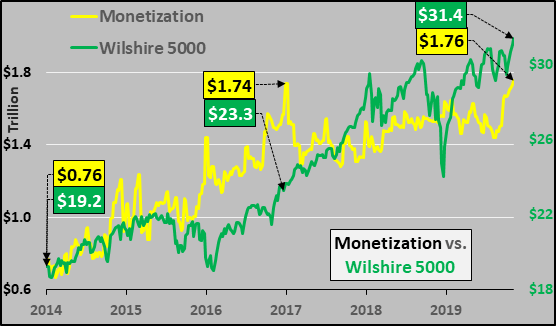
Why domestic economic decline or collapse?  This is simply following a massive population decline which has already taken place (past tense).  The chart below details the 44% fall in births since the double peaks seen in East Asia in ’67 and ’89.  This is an ongoing birth dearth of over 14 million fewer annually, since 1995.  Now this birth dearth will be compounded by the rapidly falling childbearing population of 15 to 39yr/olds, represented by the red line below (I exclude the 40+yr/olds because they simply have so few children as to simply create distraction).  By 2035, the East Asia child bearing population will decline by 30% or -202 million (no estimation, this population is already born and will just shift forward).  Absent some seismic shift (or turning away from the inflationary urbanization underway?), births will continue to tumble and national populations will ultimately likewise crumble.
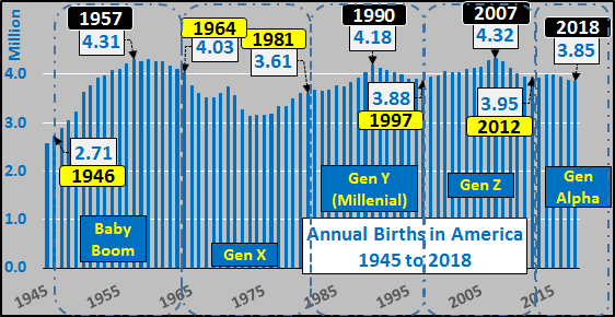
Noteworthy above is the low water mark of just 15 million births in 1996…and the muted L shaped aftermath.  Those born in 1996 will be 23 years old in 2019, or generally entering adulthood.  On an annual basis, this is a relatively sudden 50%+ decline in new adults, new potential employees, new potential parents, new potential consumers entering the economy…and this is just the start of the “new normal”.

 …click on the above link to read the rest of the article…

Monday Musings on Monetization and Markets (or Fundamentals Don’t Matter, Liquidity Does)

Monday Musings on Monetization and Markets (or Fundamentals Don’t Matter, Liquidity Does)

Being I’m not an economist nor associated with any financial or investment institutions nor do I have anything for you (dear reader) to buy or sell, I have total freedom to say what I please and freedom to share what I see.

In that spirit, I round back on the Federal Reserves balance sheet versus the curious case of excess reserves of the mega-banks.  Last week I detailed that every time the Fed has ceased adding to its balance sheet or outright reduced, the outcome has been decidedly negative for asset prices (HERE).  However, like everything, there is a little more to the story.

The chart below shows the rise in the Fed’s Treasury’s (blue line), Mortgage Backed Securities (red line), and rise plus fall of Bank Excess Reserves.  What is so interesting is that bank excess reserves didn’t begin declining when the Fed’s Quantitative Tightening began, but immediately upon the conclusion of QE in late 2014.  And excess reserves have already declined by $1.2 trillion while the Fed’s balance sheet has declined by “only” about $400 billion.

Now, if I were cynical, I’d say it’s almost like the Fed’s plan with the excess reserves was to use them like a sponge to soak up liquidity during QE and then continue releasing liquidity long after QE ended…and even well after QT was underway (actually, I’m quite cynical).  The term for this is “monetization”, something the Fed said it would “never do”.

The chart below shows the massive rise in the Fed’s balance sheet (white line), bank excess reserves (black line), and the quantity of monetization (yellow line) floating in the system just waiting to be leveraged into 5x’s or 10x’s or perhaps even 20x’s that amount.

…click on the above link to read the rest of the article…

2019 Considered…Macro Population Cycle & Business Cycle Turning Down Together?

2019 Considered…Macro Population Cycle & Business Cycle Turning Down Together?

Well, 2019 is here and it’s time to consider what sort of growth is possible.  Speaking from a macro’est viewpoint, it’s helpful to acknowledge that 90% of the wealth/ income/ savings and nearly 90% of global energy is consumed by the high and upper middle income nations of the world (those with per capita incomes ranging from nearly $90k/yr all the way down to $4k/yr).  This is the high income nations of the US/Canada, most of the EU, Japan/S. Korea, Aus/NZ, etc. plus the upper middle income nations of China, Russia, Mexico, Brazil, Turkey, Thailand, Iran, etc (as defined by World Bank…previously detailed HERE).  In 2019, this represents about 3.85 billion of earths approximate 7.7 billion population…or about half of earths population (50% consume 90%, while the other 50% consume just 10%).

So, let’s examine the primary fuel source available in 2019…the growth among the 0 to 69yr/old global consumer population.  The blue line in the chart below shows the total 0 to 69yr/old population which includes the potential working age population (20 to 69yr/olds?) and child bearing population (15 to 45yr/olds) versus the annual change in that population (red columns).  Astute chart watchers will note that population growth has decelerated by 30 million annually, a 75% reduction, since the 1988 peak.  2025 is the year growth ceases entirely and by 2035 this population is estimated to be declining by <10> million annually.

Consider that upon the completion of every business cycle since 1960 and onset of recession, (highlighted by the blacked out columns in the chart below), there was still significant growth (fuel) among the global consumer population.  That population growth coupled with the Federal Reserves rate cuts and federal governments stimulus restarted not just domestic but global economic growth.  The macro population cycle among the global high/upper middle income nations consumer base expanded anywhere from 30 to 40 million persons annually from 1960 through 1990, but growth slowed to about 20 million annually from 1995 though 2015.

 …click on the above link to read the rest of the article…

Why the Fed, Nor Any Central Bank, Can Ever Truly “Normalize”

Why the Fed, Nor Any Central Bank, Can Ever Truly “Normalize”

Last week, I highlighted that since ’00, when the Federal Reserve has ceased adding to its balance sheet or begun “normalizing” (via rolling off assets), equity markets have swooned (detailed HERE).
A simple idea today…that the end of population growth (where it matters) has long been upon us (detailed below).  Absent population growth among the nations that do nearly all the consuming, a debt based economic and financial system (to coerce ever higher levels of debt fueled consumption) can’t ultimately succeed.  That is, without population growth, assets generally don’t appreciate, homes are just shelter rather than “investments”, and debt is generally only a drag on future spending.  Likewise, without population growth, total global energy consumption is on the precipice of secular decline (detailed HERE).

In this reality, the only means of maintaining or lifting asset prices further is ever more central bank monetization (aka, centrally planned and executed counterfeiting).  Of course, this monetization scheme is doomed to fail but while it continues, the gains are privatized while the losses are socialized.  But ultimately markets (and economies, as a means of honest exchange), will get cleared.  So, without further ado, I detail the end of population growth (particularly where it matters):

1- Simply put, topline global population growth (births) ceased increasing almost 30 years ago!  Looking solely at the top-line (dashed black line, chart below), note that from 1950 to 1989, annual global births increased 73% (+57 million).  Conversely, from 1989 to 2018, annual global births have risen just 1% (+1 million).  Based on UN data and UN median (overly optimistic) future estimates.

However, the distribution of those births among the differing groupings of nations (by income) has dramatically changed from 1950 to present…and will shift further by 2050.

 …click on the above link to read the rest of the article…

A Debt Based System Can’t Succeed Without Population Growth

A Debt Based System Can’t Succeed Without Population Growth

A simple idea today…that the end of population growth (where it matters) is upon us.  Absent population growth among the nations that do nearly all the consuming, a debt based economic and financial system can’t ultimately succeed.  That is, without growth, assets generally don’t appreciate and debt is generally only a drag on future spending and activity.  The timing of the failure can be delayed and the gains privatized while the losses are socialized, but ultimately markets (and economies, as a means of honest exchange), will get cleared.  So, without further ado, the end of population growth:

1- Simply put, topline global population growth (births) ceased growing almost 30 years ago!  Looking solely at the top-line (chart below), note that from 1950 to 1989, annual global births increased 73% (+57 million/annually).  Conversely, from 1989 to 2018, annual global births have risen just 1% (+1 million/annually).  Data based on UN data and UN median estimates.

However, the distribution of those births among the differing groupings of nations (by income) has dramatically changed from 1950 to present…and will shift further by 2050.  The chart below shows the proportion of births among the high income, upper middle income nations, and China have nearly fallen in half since 1950…while the proportion of births among the lower middle and low income nations have soared.  More simply put, births among those that consume heavily (about 90% of total energy) have long since collapsed while births among those who consume relatively little (less than 10%) have soared.
But now, lets look at the sources and timing of those changing births and the implications for consumption.
High income nations births (blue line) and year over year change (red columns).  Incomes range from $90k to $12k, per capita, and these nations (US/Can, EU, Japan/S. Korea, Aus/NZ, etc.) consume 47% of total global energy.

 …click on the above link to read the rest of the article…

Most Bearish of Economic Charts Are Reason To Be Most Bullish on Financial Assets

Most Bearish of Economic Charts Are Reason To Be Most Bullish on Financial Assets

In the land of the blind (economics), the one eyed man is king.  So, forget everything you know (or don’t know) about economics and follow some very simple math that economists (and financiers, Fed chiefs, and administration after administration) are unwilling to publicly acknowledge.  Disregard theories about ever greater production equating to economic growth…all that truly matters is the ability to consume that production (otherwise production turns into excess inventories).

Simply put, every person on earth is a unit of consumption multiplied by their income, savings, and access to and/or utilization of credit (even if it is government provided via social programs).  Thus, it is the annual change in the population (multiplied by these levers) which is the primary driver for the annual change in consumption.  But population growth among the nations with the income, savings, and access to credit has fallen in half since peaking decades ago…and growth among the all important work force is facing imminent and ongoing decline.
Thus to maintain consumptive growth, a series of stop-gap steps have been undertaken, each more drastic than the last.  First, unfunded governmental social programs alongside interest rate cuts were used to entice higher consumption absent higher income or savings.  Once this broke down, governments and central banks took over debt creation and asset eradication in an attempt to maintain still higher consumption without the concomitant rise in income/savings.
However, these policies and actions to maintain consumptive growth (enabling higher production) are about to become far more difficult if not impossible.  The lack of population growth among the consumer nations coupled with the negative distribution of that growth (almost solely among the elderly) is set to slow growth to a crawl or cause outright declines.  Why?

…click on the above link to read the rest of the article…

Olduvai IV: Courage
Click on image to read excerpts

Olduvai II: Exodus
Click on image to purchase

Click on image to purchase @ FriesenPress